• Yubi Studio
  • Portfolio
    • Art
    • Photography
    • Hanbok
  • Store
  • about
  • blog
  • subscribe
  • contact
  • Menu

UB Studio

  • Yubi Studio
  • Portfolio
    • Art
    • Photography
    • Hanbok
  • Store
  • about
  • blog
  • subscribe
  • contact

Dianthus

April 21, 2022 in Art

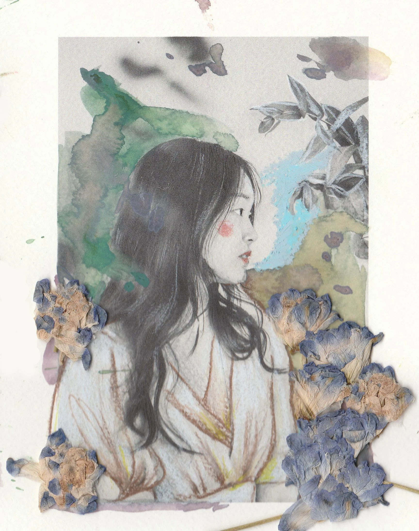
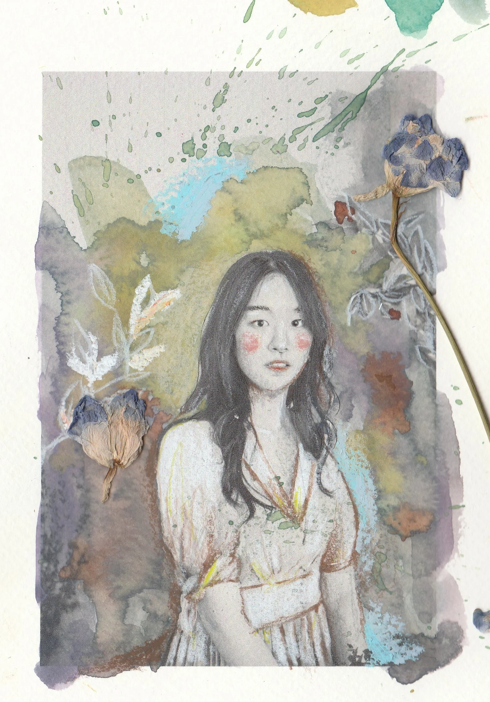
I have been working on a new collection, as my school project. I've been waiting for starting a new collection - to draw more on my photographs. Since I've been so prolific in my photoshoots, I had so many to choose and to tell the stories of the subjects. The feedback I received from last quarter in school was to try out new mediums to enhance the quality of illustration. Thus I incorporated color pencils, and added more layers on top to create depth. It's still a challenge for me to carve out time to make artwork along with doing photoshoots because it's a new try. But I always think about creating a tangible artwork that has depth, dimensions, and texture... Hopefully someday it will be hung on many people's walls.

I got inspired from a Japanese Painter Tadashi Asoma, an Abstract Expressionist and Japanese immigrant to America in 1960s. I mean my works do not look like anything like his (laugh), but I really loved his color palette and the mountains he draw behind the scenes. The mountains of Japan, New York, or wherever that is, that really echoed with me and wanted to incorporate those oriental lines. But my main inspiration was my subjects, as I tried to remember the time I had with my people during the shoot, or any memories that I have with them. It was like having another photoshoot with them, but like alone, and it was more reflective and memorable. The photoshoot was more of a connecting point, and the mixed media photography is more of my own aesthetic, quality time that I have.

Comment

Pre-dianthus

April 21, 2022 in Art
Comment

Royalty of Warmth

April 21, 2022 in Art


This collection was my final works for a printing class. I've explored more than 20 different inkjet papers to find out which paper is fit for my own artworks. Interestingly, the final paper I chose was neither of the 20 I explored; however, because of the huge experiment, I knew exactly how to print on this non-inkjet paper properly and professionally (Thank you professor Jones!) My main subject was definitely portraits and self portraits also. I loved how the prints would naturally mute as the tan mix media paper will bring everything - saturation and exposure- down to bottom and I adored that. On the print I added lavender purple color paint to bring the dullness a bit up and to tweak with a modern touch. I used color pencils to enhance the facial features and oil pastels for rich highlights especially the whites.

This time of period my Artist Quiet Time group (AKU) was meditating about the "sacrifice" we give to Jesus as we enter the preparation of passover. And We talked about how worship is different from sacrifice; worship is when we go to church on Sunday and receive such joy and blessing from God, sacrifice, is when we give our time, effort, talent, to Jesus intentionally. Usually not on Sundays, in our daily lives. Meaning, as artist, pastor reminded us to remember what was the first love, first talent as artist God gave me. And that should be the way we give sacrifice to Jesus. It's not about drawing biblical characters or somewhat holy works, but praying before my works for this time, my talent, my sweat and tears to be given to Jesus as a sacrifice. The purple represents royalty of Jesus as he should be the only one to be glorified in all my works. Enjoy!

Comment
Prev / Next

Wells Blog

Duis mollis, est non commodo luctus, nisi erat porttitor ligula, eget lacinia odio sem nec elit. Maecenas faucibus mollis interdum. Nulla vitae elit libero, a pharetra augue.


Featured Posts